


WURA WTF
An easy way to understand Work Unit Routing Analysis (WURA) is to start with its predecessor, Product-Quantity-Routing (PQR) analysis.
You’ll find PQR analysis used in settings where there are a lot of small-batch custom orders. Take a print shop, paint shop, or light manufacturer that has to set up and configure workspaces and equipment for a specific run of work, ship those off, and then re-set and re-configure things for the next, different, run. This is an environment where some things are always different, and other things are always the same. Knowing which materials—supplies, stable intermediate forms, scrap/junk, and final products (P)—are being produced and in what quantities (Q) as they’re routed (R) across the shop becomes the basis for various insights.
WURA was the extension of this analytical approach to clinical settings, and from there into other types of work—including the hopelessly computer-addled work I get involved in. To call the products of labor ‘work units’ (WU) upon which one could perform a similar routing analysis (RA) is a meandering walk but it eventually gets us to the WURA acronym.
My experience has been that some people have heard of PQR and others WURA. The happiest people have heard of neither.
When you might use WURA
WURA is a great fit for low-volume, moderate complexity, highly variable work. When I hear something like “we don’t have a process” or “every <instance> is different” I consider whether WURA might be an appropriate format to use.
I’ve personally used WURA:
- To document various ways projects got approved inside a corporation while bypassing the official, mandatory approvals mechanism.
- To discern how a real estate company prepares distressed properties for sale at auction across various geographies, property conditions, and the like.
- To understand billing procedures for a professional services firm across its various lines of business and combinations of customers, industries, and project types.
How to run WURA
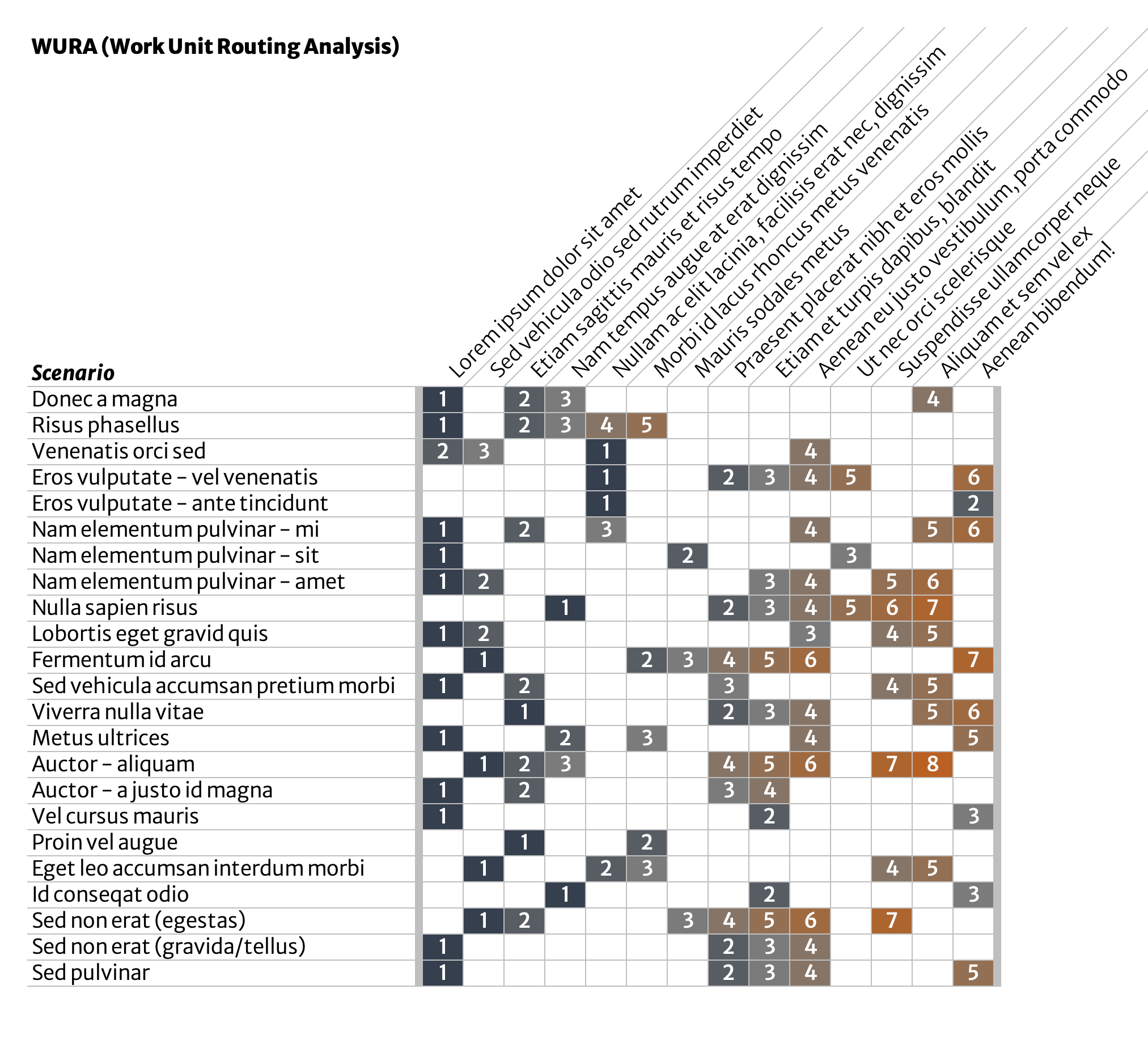
Describe a single scenario
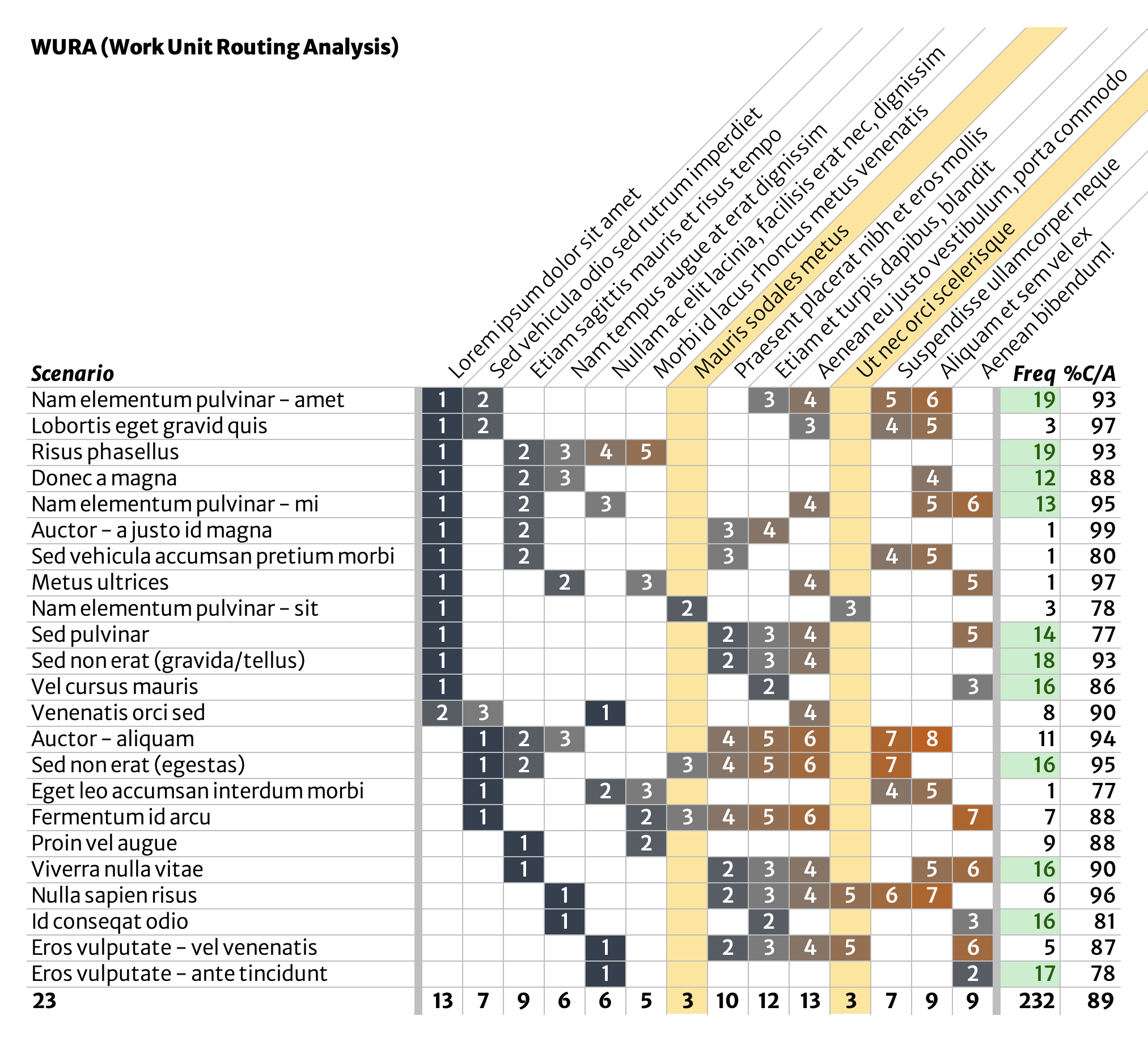
First, document a single scenario in a single row in a data table. In this example, there are six major process steps, numbered 1-6 and each given a short but descriptive name.
The easiest way to get this down is to follow a single ‘work unit’ around and see what people do. This initial scenario doesn’t have to be a typical or even common case; it’s merely the first one you’re writing down. Don’t worry about exceptions handling or alternate scenarios yet. These will get their own rows later.
Any methods you’ve used elsewhere for identifying and distinguishing process steps will work here. (For example: look for transitions, hand-offs, or notifications.)

Document additional scenarios
Next, document as many additional scenarios as you encounter, using the same format. Number process steps in sequence. Add new process steps as you see them. This list is totally unordered at this point. Keep adding exhaustively.
Exceptions, special cases, rush jobs, undisussables—each get their own row.
Seek to keep process steps at approximately the same level of detail. Split, combine, and rearrange in order to match what is actually happening.
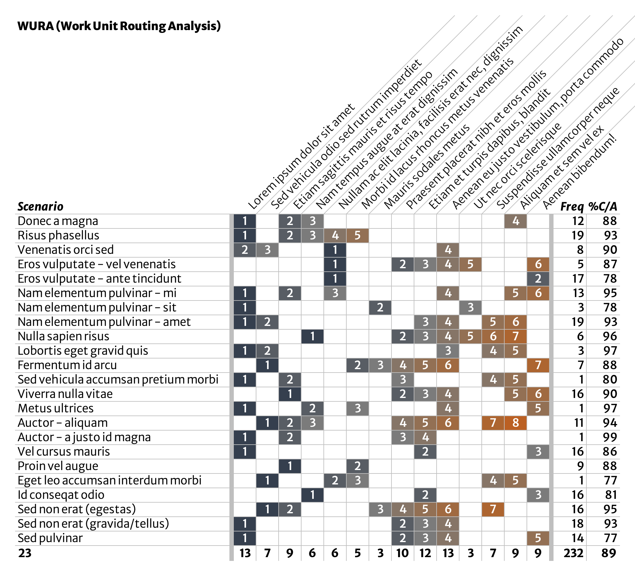
Annotate with frequency & quality data
At some point you will exhaust scenarios people can show you or that you can observe. Someone might say that “every <instance> is different” but the finite length of this scenarios list indicates otherwise—at least when viewed from a this level of abstraction.
Once you’ve gotten here, annotate the list with a few data points for each scenario. What’s important to measure? Use your best judgement, tempered by availability of data. Two good starting points are those shown in our example:
- Frequency: # of ‘work units’ produced via this scenario over a certain time (a month, a quarter, a year).
- %C/A: percent complete & accurate; this is a percentage of work items that are both complete (nothing missing or broken) and accurate (correct) as they exit each scenario.
- Not shown here, but much more powerful, is to also measure %C/A for each process step. In this case, you’d want to measure how often work items enter the given process step without quality issues.
- This can also be a good moment for a conversation about accuracy and how it is or should be determined.
Initial analysis—what do scenarios have in common?
Sort and slice. In this example, about half of the scenarios, and a majority of the overall volume, begin with the same process step (‘Lorem ipsum dolor sit amet’, seen in the second column of the table). Ask yourself what these have in common.
What about scenarios that start with some other process step? Extend this initial analysis to also include the ‘Sed vehicula audio sed rutrum imperdiet’ process step and you’ve identified where most work starts, even though “we don’t have a process.”
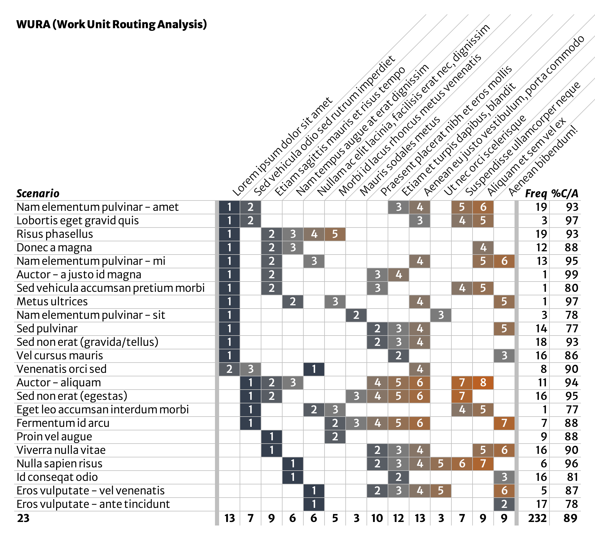
You might also notice a little set of three process steps, highlighted below, that are a feature of several scenarios. What might these have in common? What’s the case for scenarios relying on one or two, but not all three, of these process steps?
Lines of questioning like this can help you notice possibilities for simplifying or standardizing work in beneficial ways.
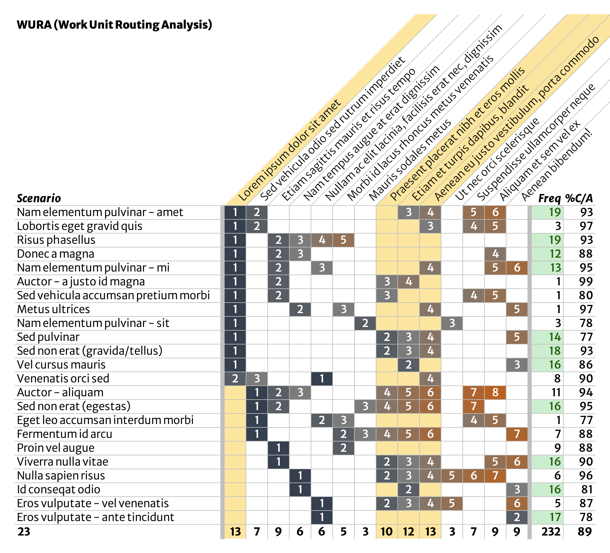
Initial analysis—clean up outliers
Another very quick analysis is to look for the true outliers. The highlighted process steps below appear only in a handful of scenarios, and only one of those scenarios (‘Sed non erat gravida/tellus’) arises at a decent frequency. These process steps might be eliminated entirely, possibly even by adjusting or removing the scenarios they are a part of.
Anything that can be removed entirely is a treasure.
Possibilities for further analysis
- Determine which process steps contribute most to overall volume. This is an area where WURA can get you in trouble, because the most visually busy process steps might not be the ones you’re looking for.
- Isolate process steps where errors are produced and build in quality along the way.
- Measure worker sentiment/happiness with each scenario.
- Group scenarios into scenario families based on their similarities. Organize continuous improvement at this scenario family level if working on individual scenarios one at a time doesn’t seem like it’s enough.